Browse by Color
Find textures by their dominant color family. Whether you need warm reds for a brick wall, cool blues for water surfaces, or versatile neutrals for concrete and stone, browse our library by color to find the perfect match for your project.
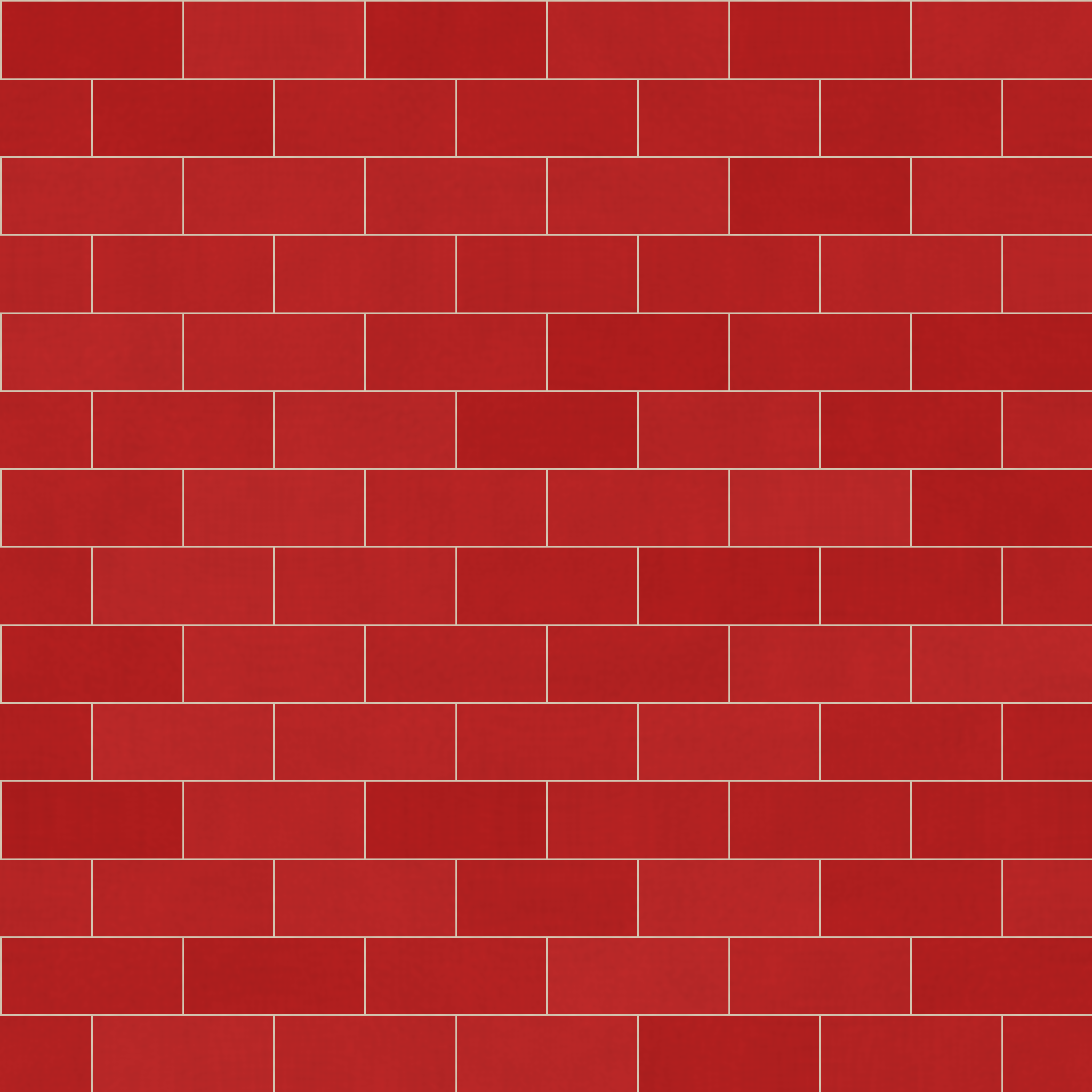
Reds
65 texturesWarm and bold. Red tones bring energy to brick, stone, and abstract designs.
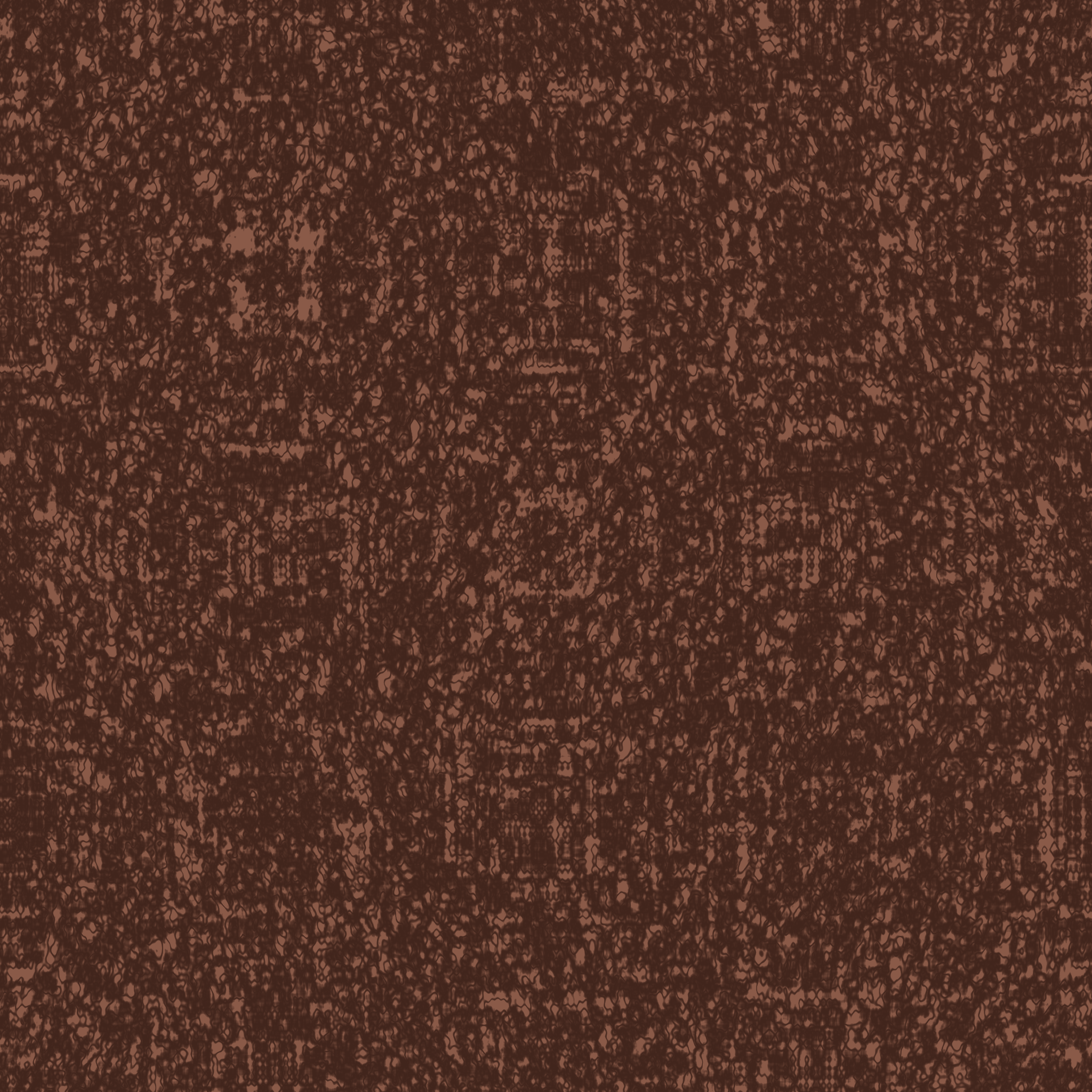
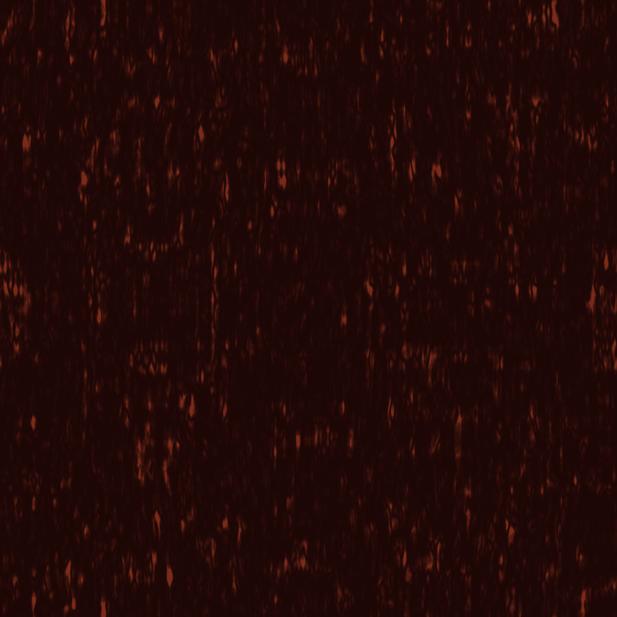
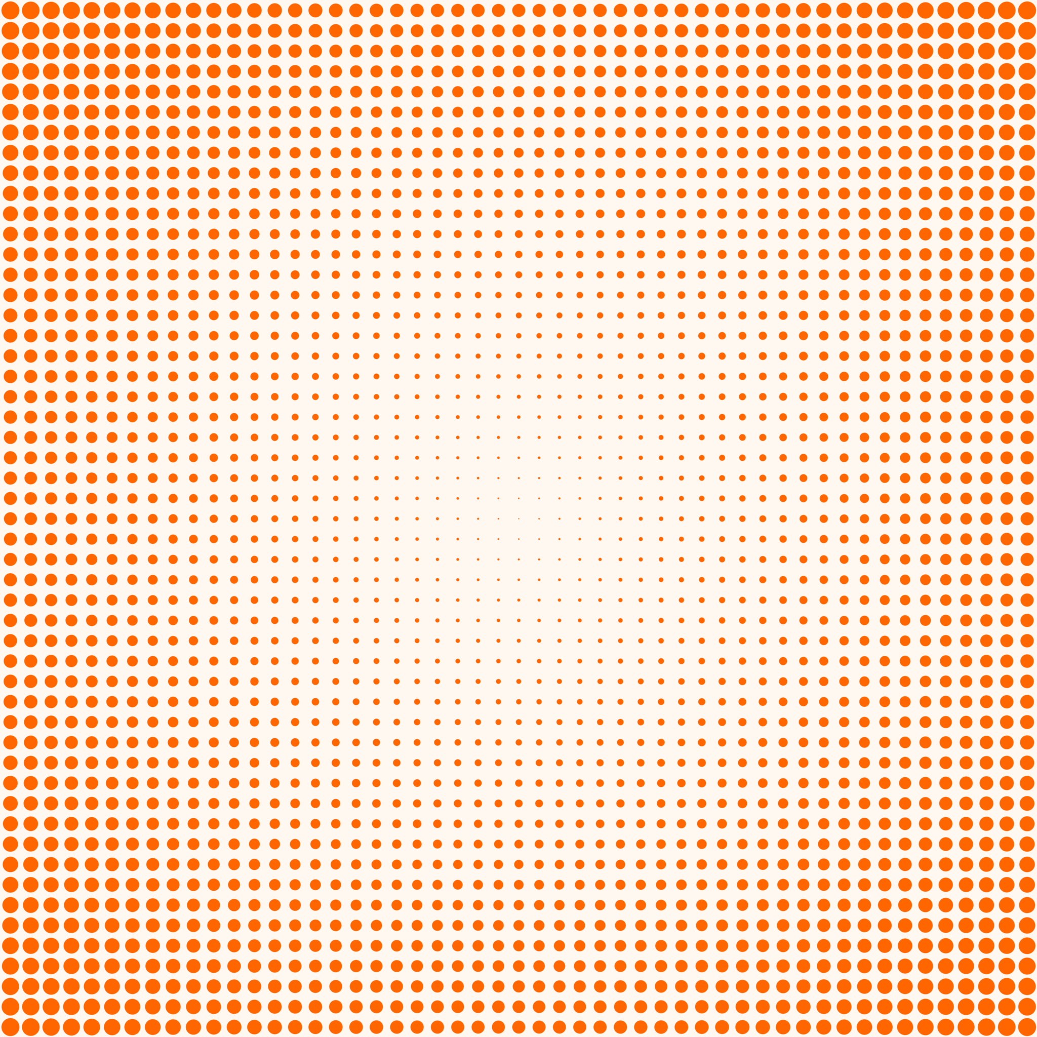
Oranges
124 texturesEarthy warmth. Oranges appear in terracotta, clay, rust, and autumn materials.
Yellows
15 texturesSunlit surfaces. Golds and ambers for sandstone, wood, and metallic textures.
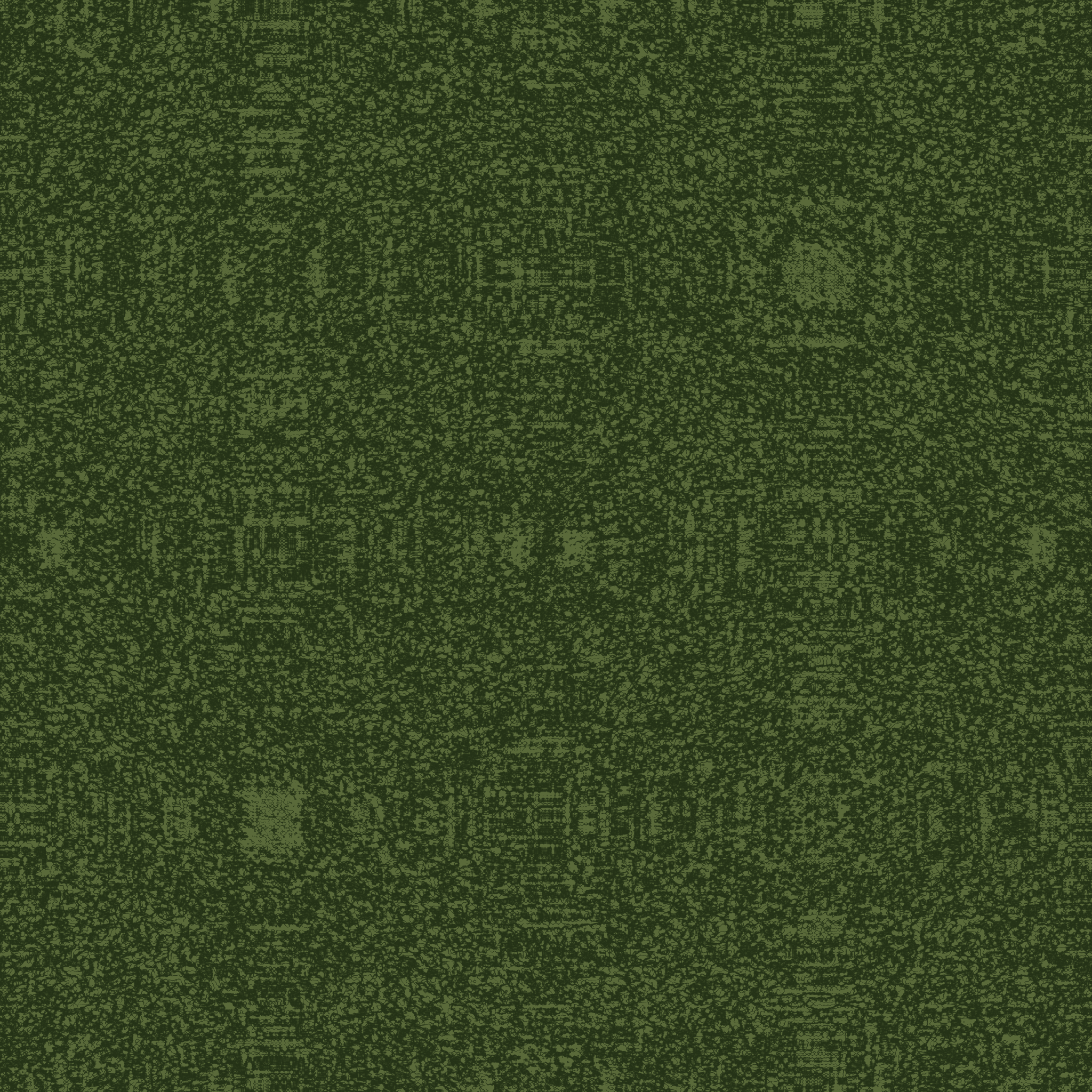
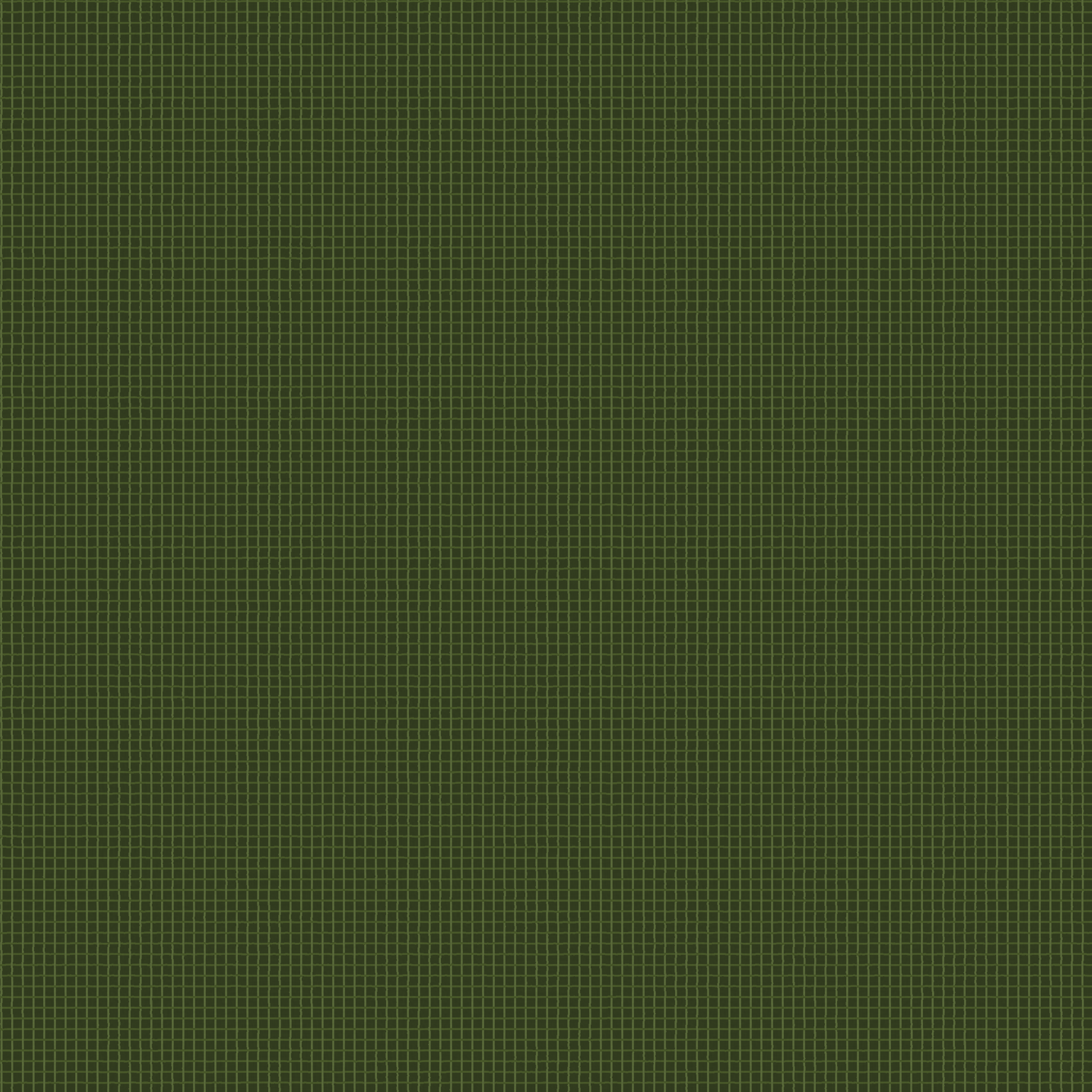
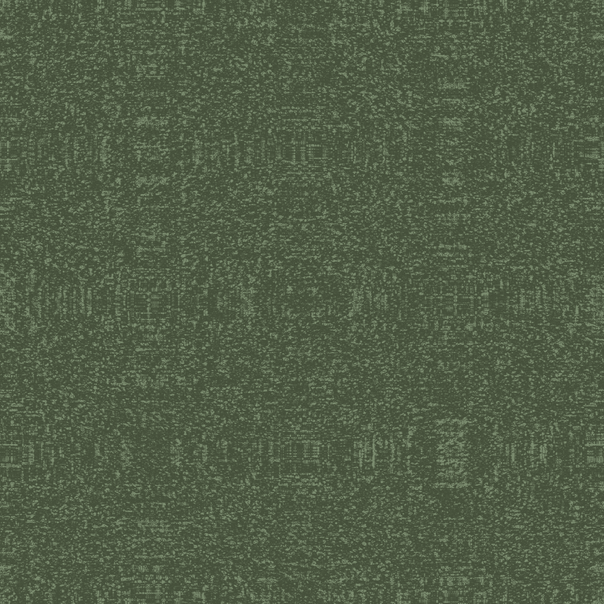
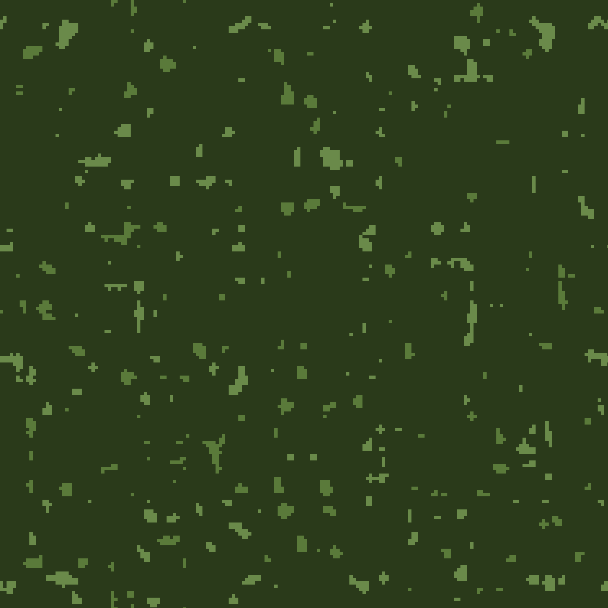
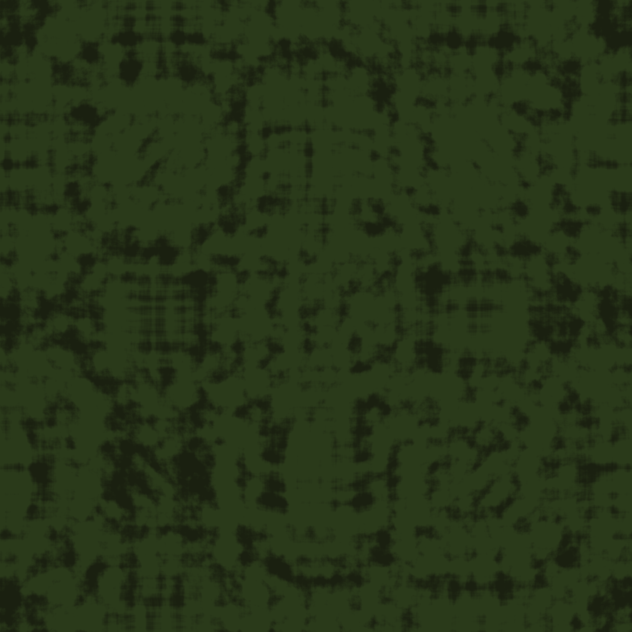
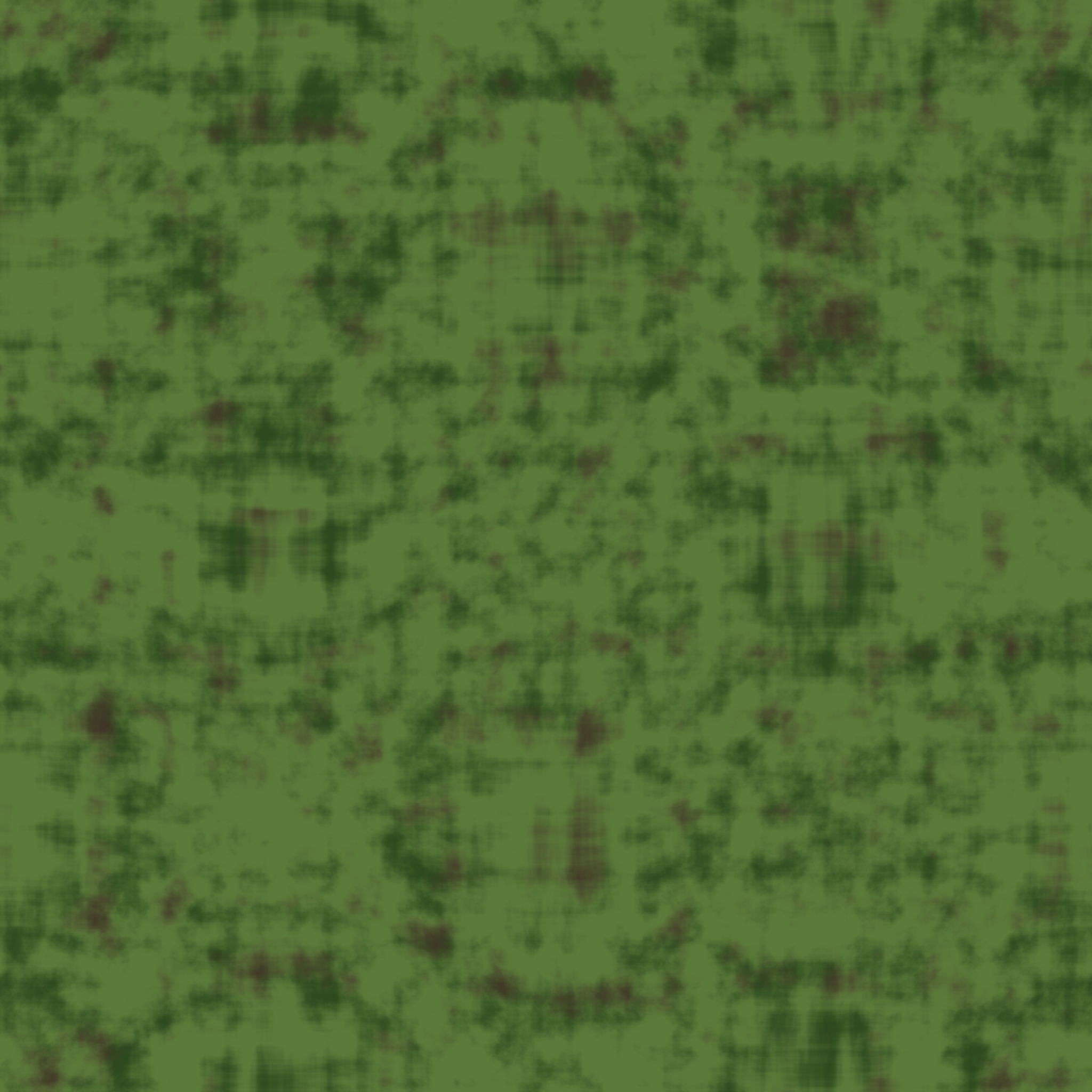
Greens
42 texturesNatural tones. Greens for moss, foliage, patina, and organic surfaces.
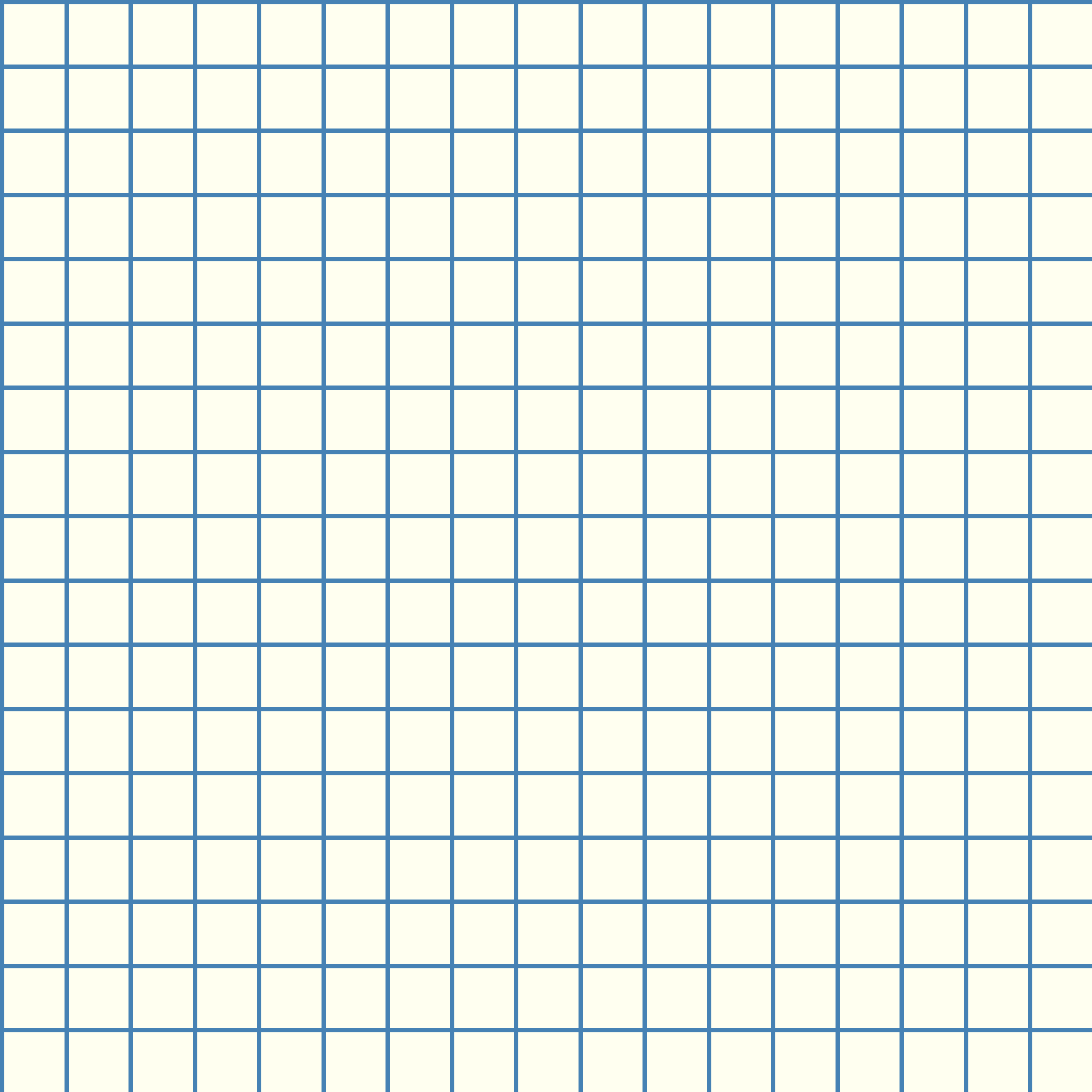
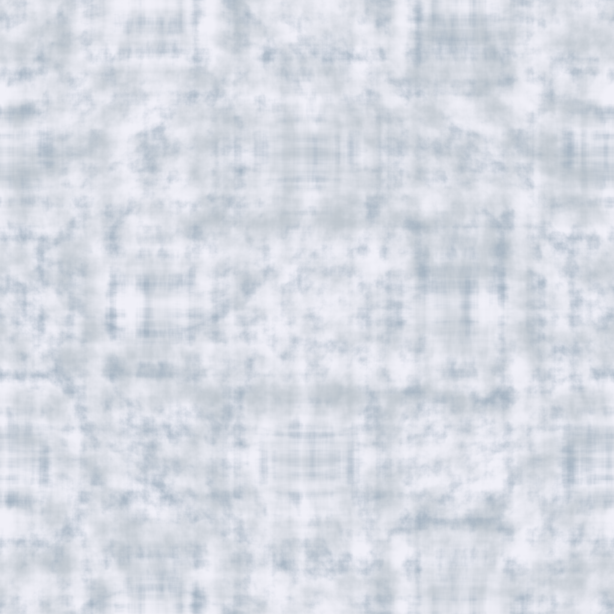
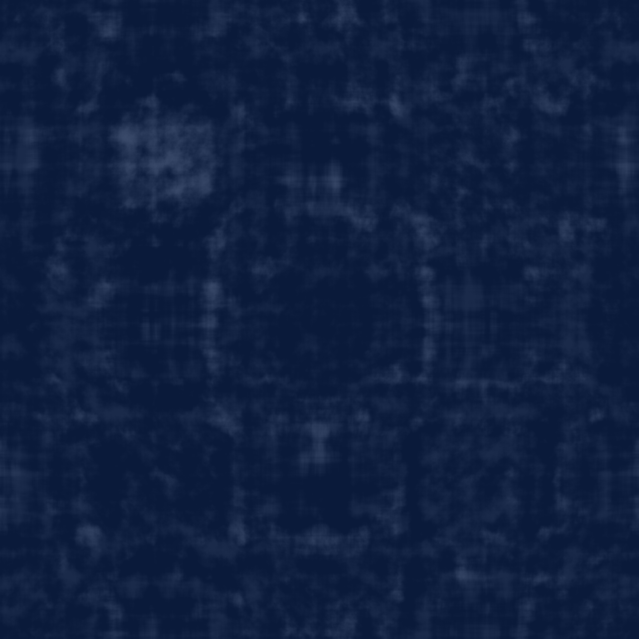
Blues
80 texturesCool and calm. Blues for water, denim, metal, and architectural surfaces.

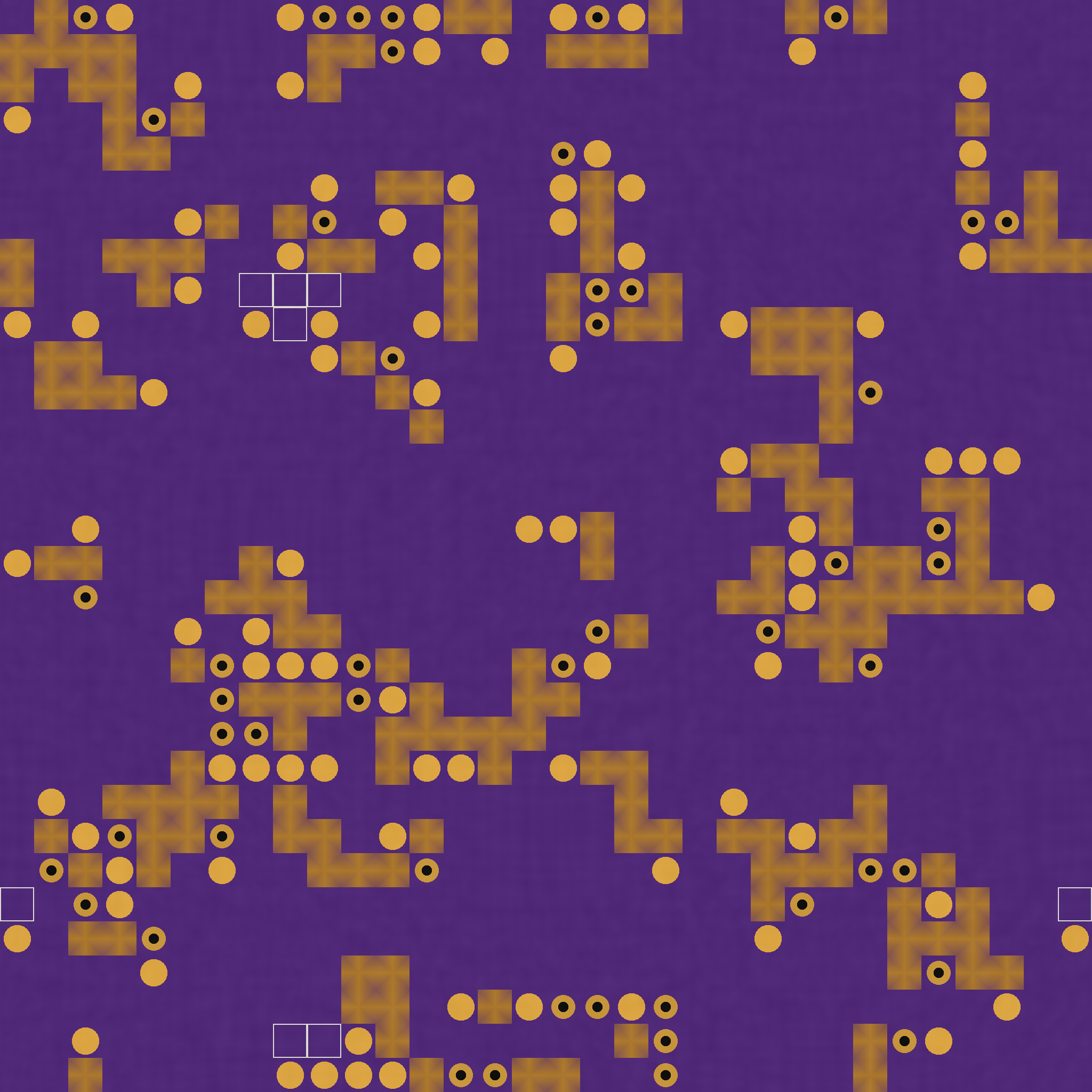
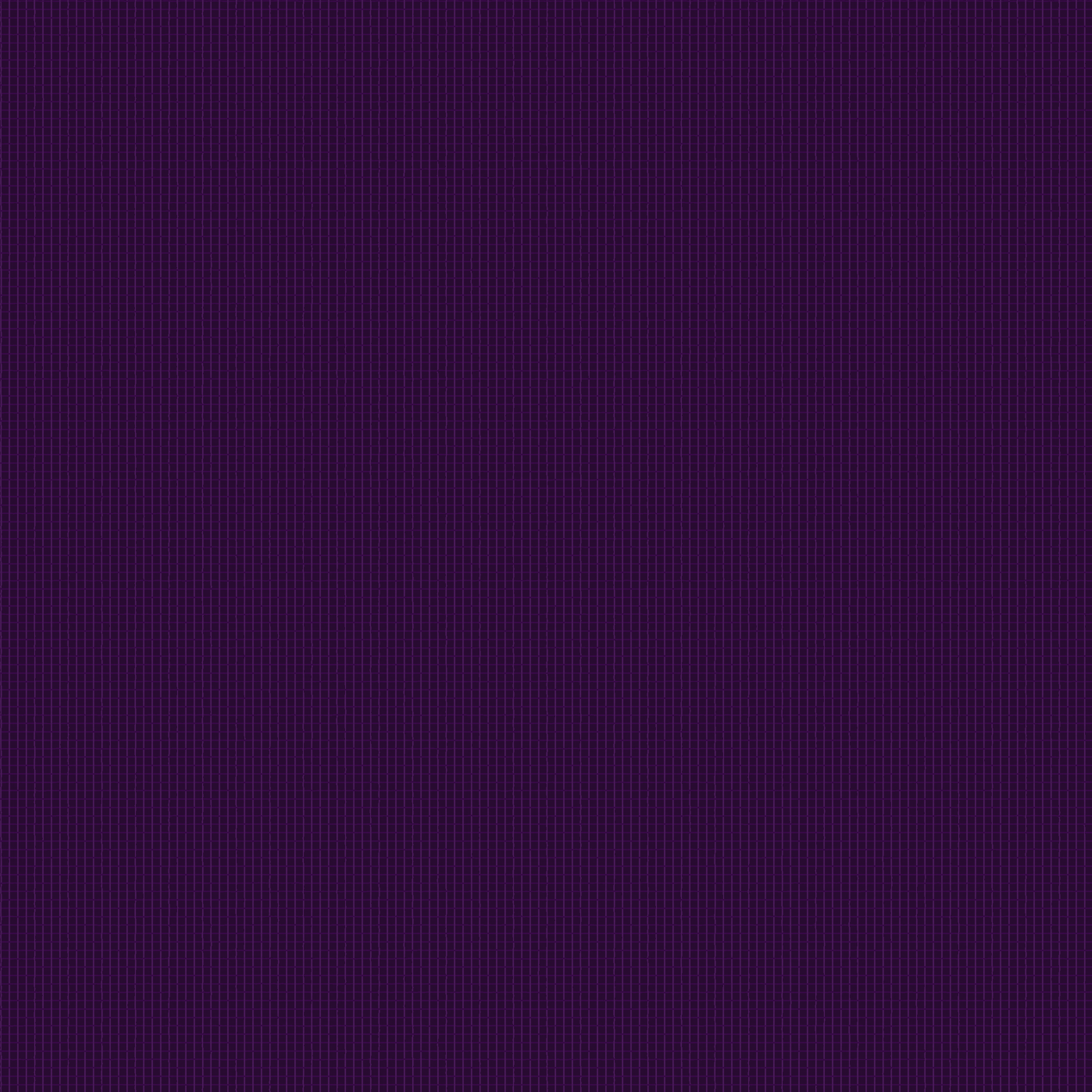
Purples
11 texturesRich depth. Purples for fabric, mineral, and artistic abstract textures.


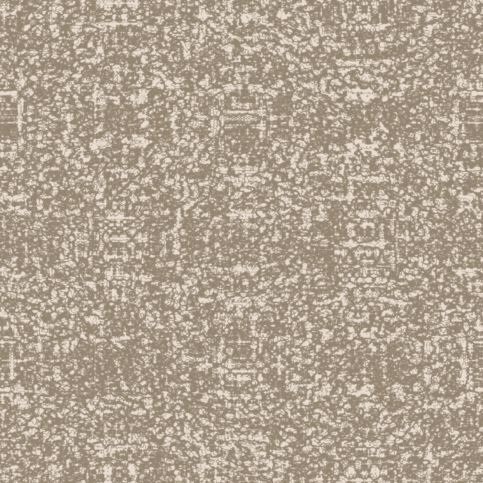
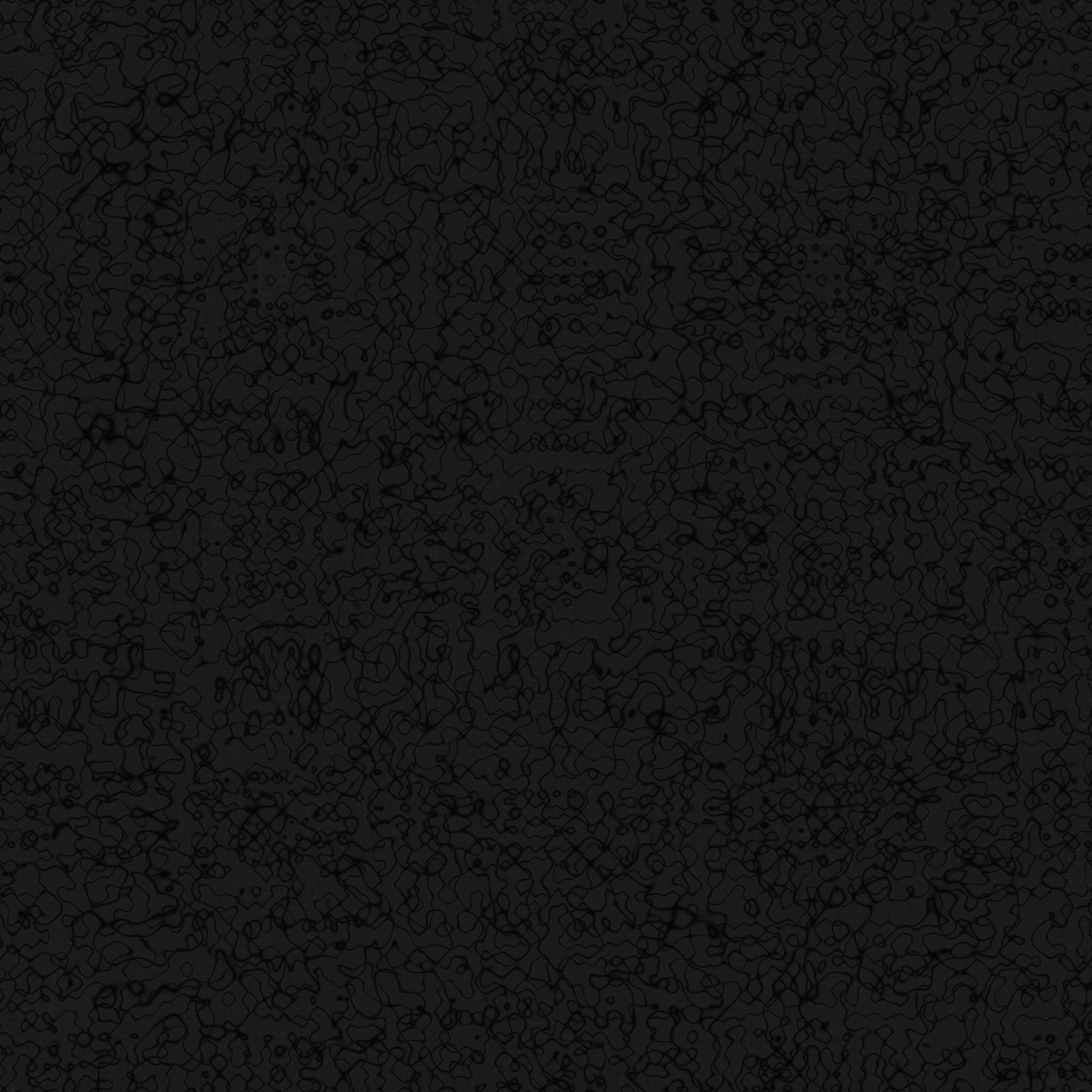
Neutrals
152 texturesVersatile foundations. Grays, whites, and blacks for concrete, paper, and stone.


Looking for a Specific Color?
Create custom textures in any color with our procedural generators. Full control over hue, saturation, and tone.
Choosing textures by colour
Warmth, value, saturation — the three axes that matter
Every colour in a texture can be decomposed into three perceptual dimensions. Hue is its position on the colour wheel — red, orange, yellow, and so on. Saturation is how much of that hue is present versus grey; a fully saturated red has no grey in it, a low-saturation red is a dusty brick tone. Value is how light or dark the colour is, independent of hue. A near-black with a blue cast and a near-white with a blue cast are both blue, but they behave differently in a composition.
The colour families listed above organise textures by their dominant hue. Within each family, textures still vary widely by saturation and value. A "warm orange" surface with high saturation reads as vivid and active; a "dark orange" surface with low saturation reads as aged terracotta or leather. Filter by family first, then scan the grid for the saturation and value character you need.
Warm versus cool palettes in material design
Warm palettes (reds, oranges, yellows, earth tones) read as inviting, tactile, and human. They work in hospitality design, autumn editorial, food and beverage branding, and anywhere a sense of warmth or age is desired. Cool palettes (blues, greens, teals, purples) read as technical, calm, and refined — typical of healthcare, corporate architecture, winter and arctic scenes, and premium electronics. Neutral palettes (greys, near-blacks, near-whites) adapt to either direction and work as background or primary surfaces depending on context.
How colour interacts with material perception
The same surface can read as completely different materials depending on its colour. A cream-to-grey marble reads as classical and luxurious; the same marble pattern in deep green reads as fantasy or jade. An ochre wood reads as weathered oak; the same grain in cool grey reads as modernist or washed-out. Colour choice carries more material narrative than most designers expect — picking the right colour family early can make scale and pattern choices later feel inevitable.
For realistic renders, keep saturation modest — real materials rarely achieve the high saturation that monitors can display. A fully saturated red leather looks like plastic; a moderately saturated red leather looks like leather. For stylised and branded work, higher saturation can be the goal rather than a problem.
Neutral palettes are doing more work than they look
Pure black and pure white almost never appear in real materials. Near-black surfaces (asphalt, basalt, carbon fibre) always have a subtle hue cast — slightly blue for polished carbon, slightly warm brown for weathered asphalt, slightly green for oxidised bronze. Near-white surfaces (marble, concrete, plaster) similarly carry warm cream or cool blue undertones. These subtle hue biases are what separate a convincing material from flat colour. Every texture in the neutral families preserves that tonal bias rather than collapsing to true greyscale.